Santa Maria Maior Church
Portugal
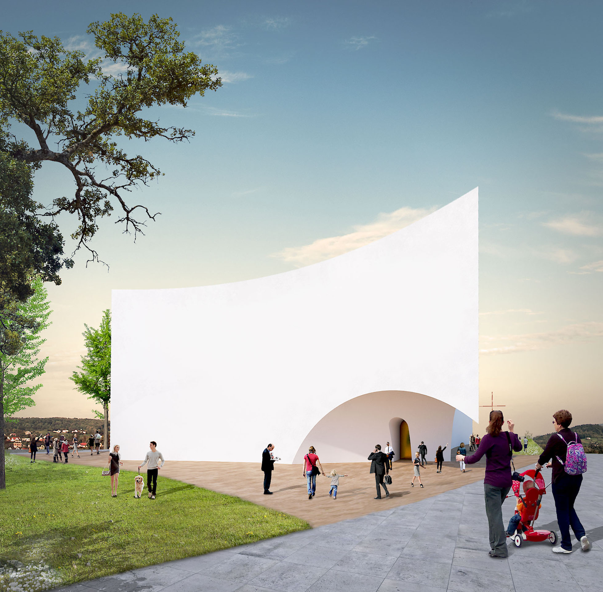
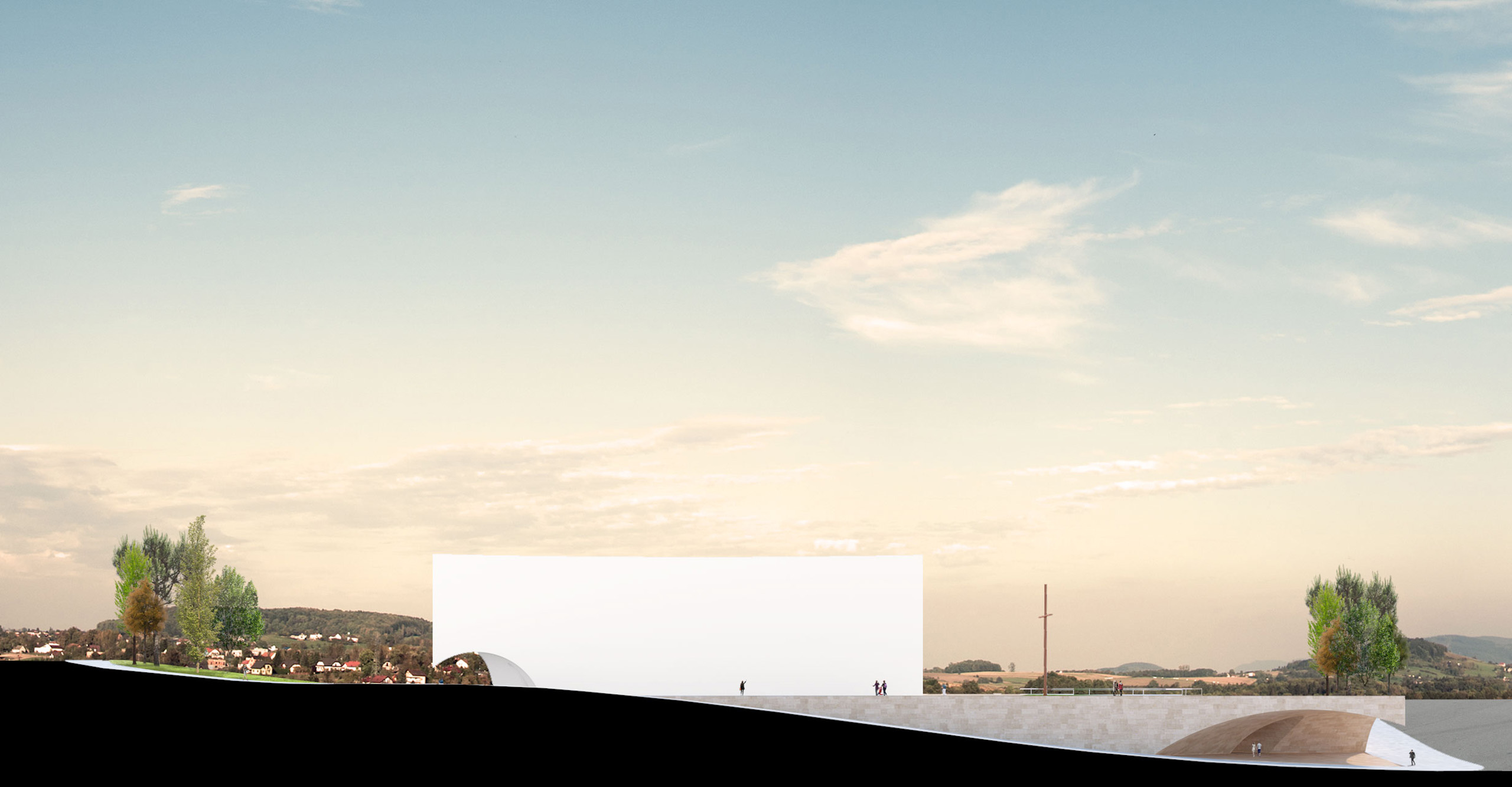
Starting from the matrix of the place, the intervention aimed to take advantage of the existing topography so that a functional, monolithic base could be created to receive the functions related to the parochial activities, on which the church would be implanted, thus allowing the Completely independent use of these two functional blocks.
The base:
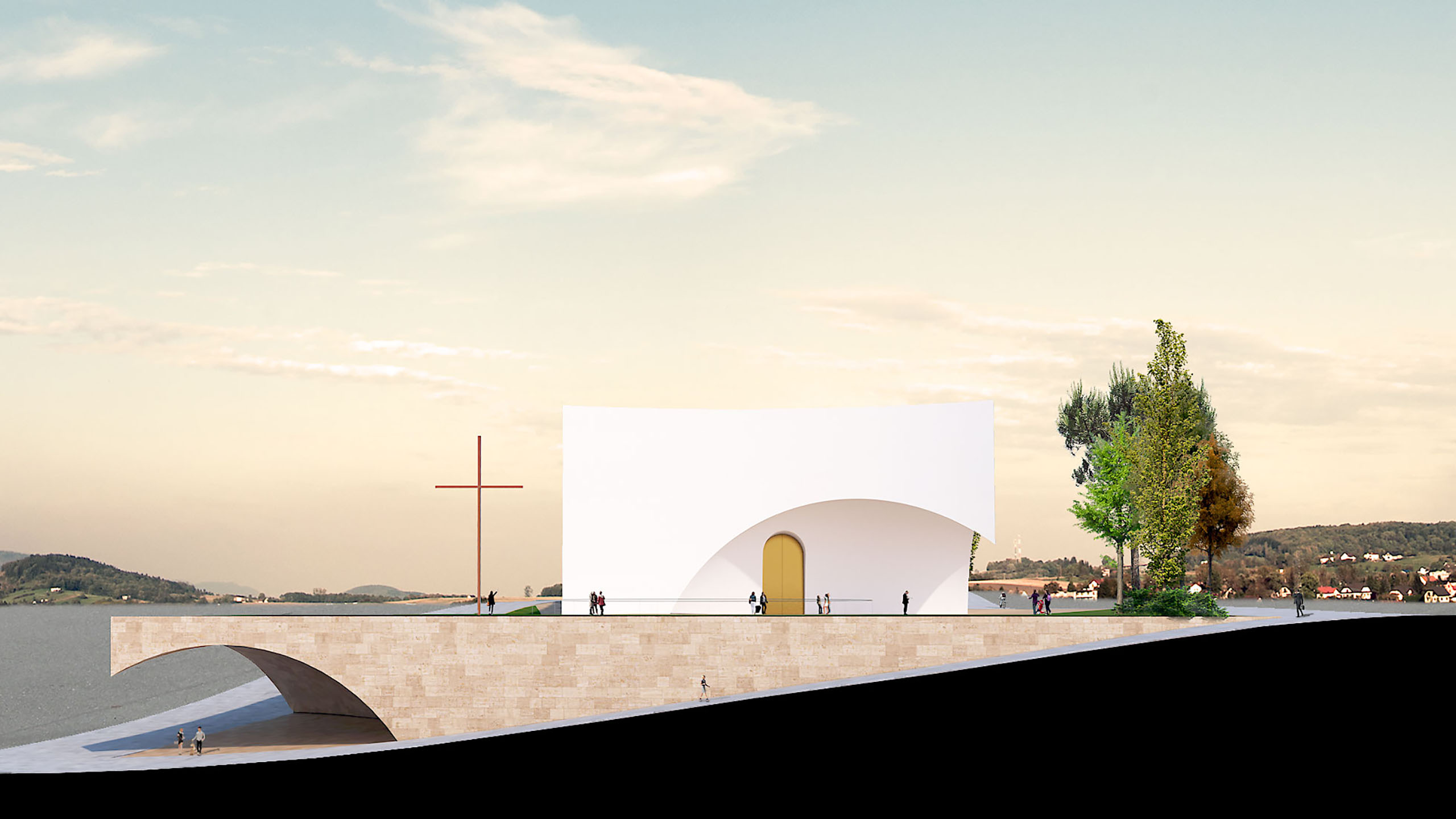
We began with the idea of implanting the church on a street-level platform that links us to the current church, thereby facilitating its connection and reinforcing the importance of the link between the present and the past. This option allows us to create a kind of functional base, that takes advantage of the unevenness between streets to gain expression and function.
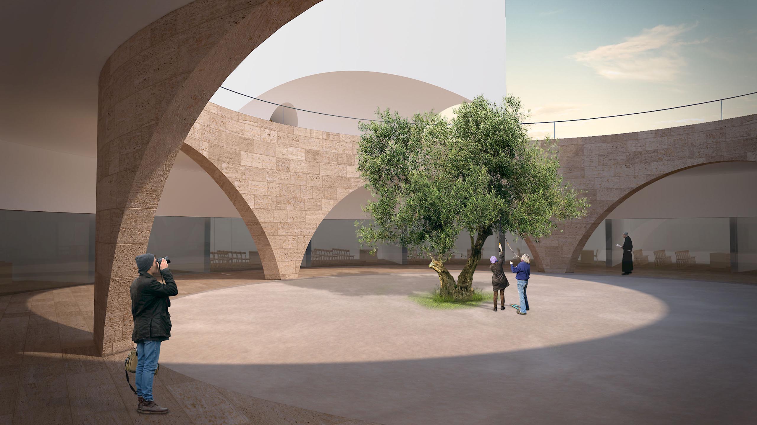
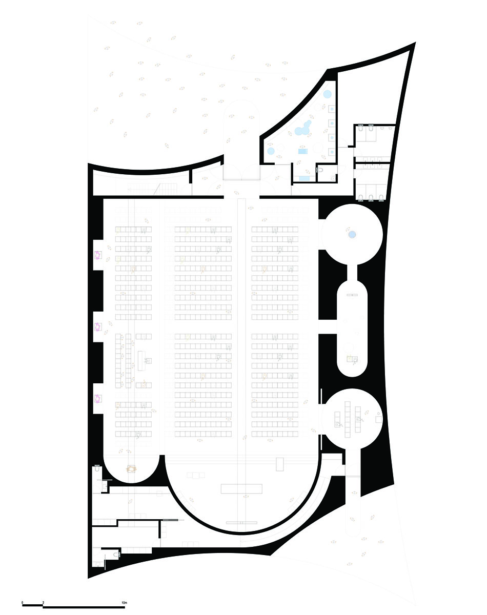
The image of a monolithic foundation, solid and perennial in time, invades us completely, as well as the idea of taking advantage of all its interior to create the services of support to the religious activities, such as rooms of catechesis and its secretariat, parochial registry office. A parson's reception room and mortuary chapels, distributed around a circular patio of generous dimensions, in a clear contemporary reference to the classical cloisters, through which one can wander in introspective reflections on the daily life of the parish.
The church:
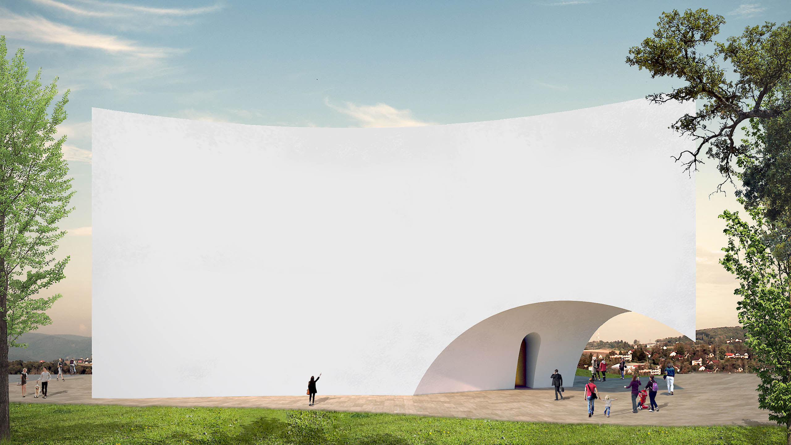
We proposed to place the church on the previously characterized base, assuming a prominent role in the urban setting.
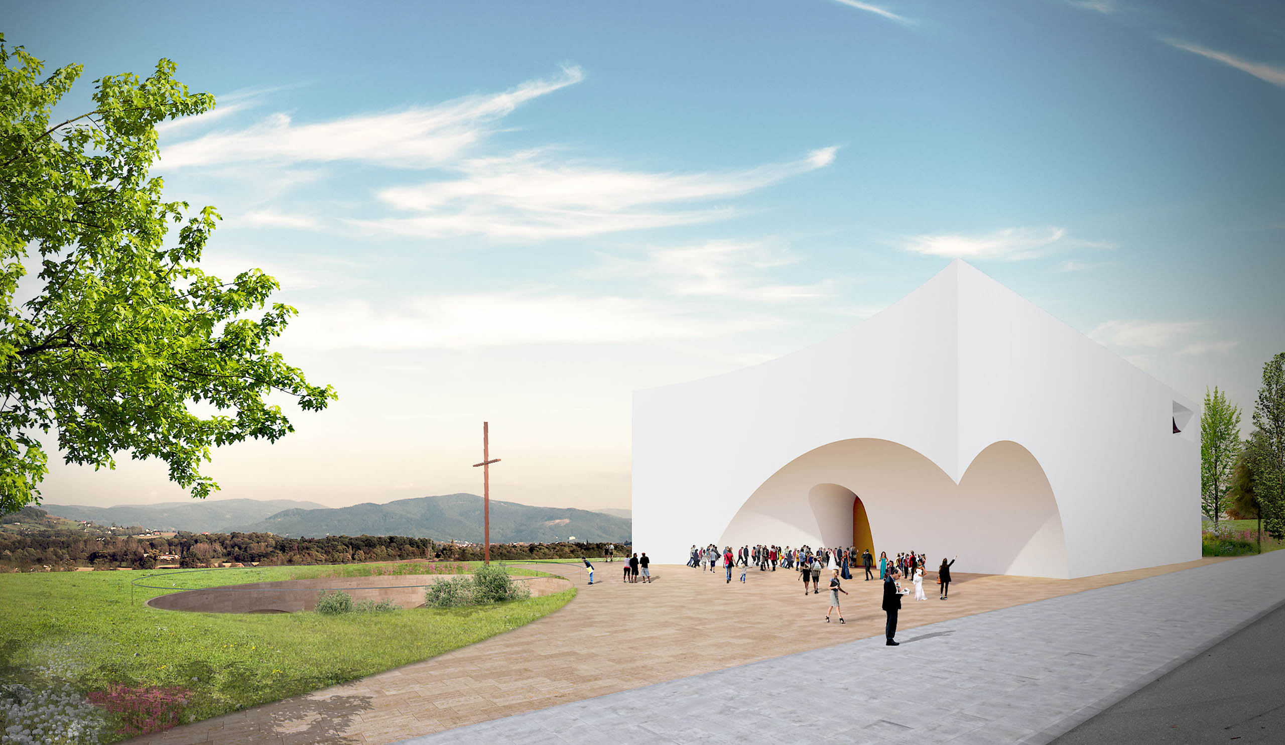
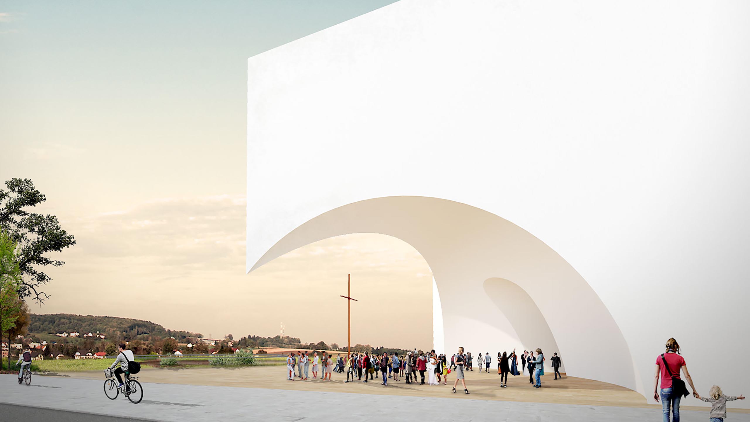
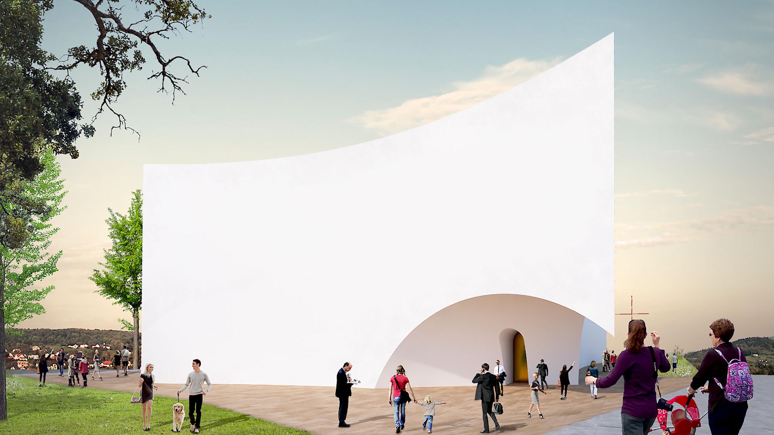
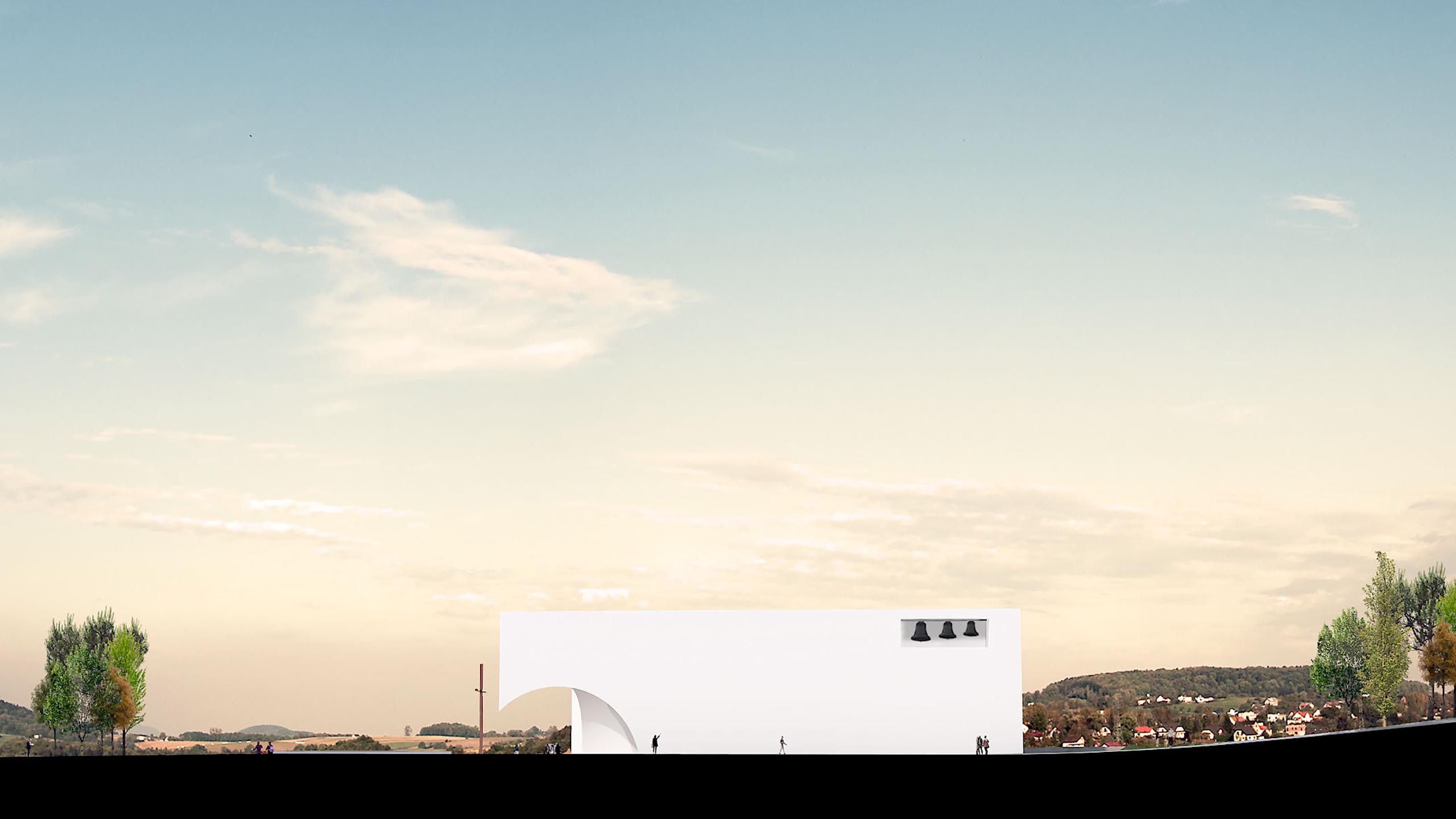
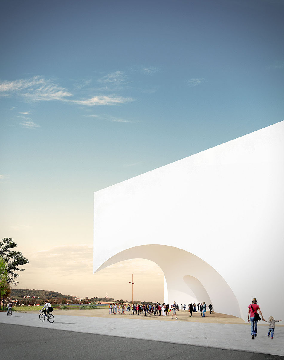
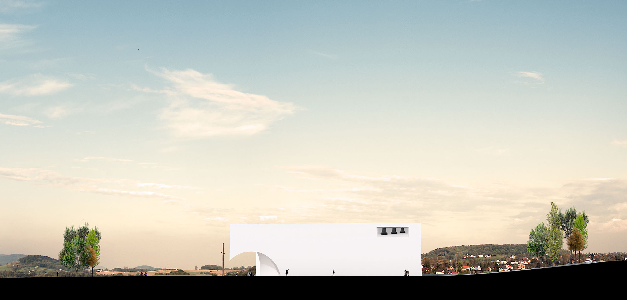
Outwardly, the church presented itself as a simple volume, white in colour, evoking simplicity and purity, which reacts to the demands of surrounding flows and makes their faces slightly concave, allowing more space for people to concentrate around the church, simultaneously establishing the perspectives that define the form, leading people towards the points of entry.
The entrance to the church is made by two opposite ends. The main entrance is made by a large door, which symbolizes Christ ("I am the Door"). It is an invitation to discovery and prayer. The door is protected by spherical suppression with a transcendental scale while emphasizing the idea of protection and preparation for entry into the prayer space.
The second entrance to the church is located on the opposite side of the main entrance, with a smaller scale, claiming for itself a more controlled use of this same entrance. This access allows a direct entrance to the sacristy and chapel of the Most Holy in a more direct way.
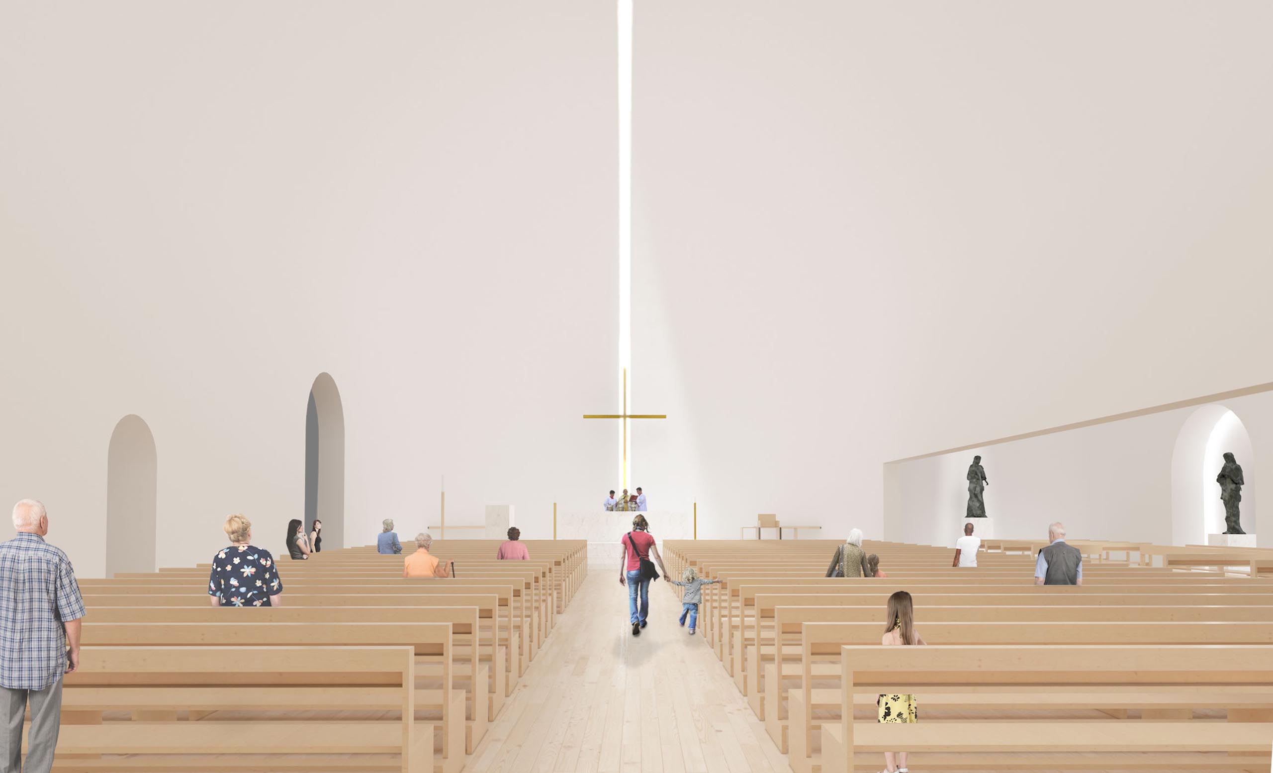
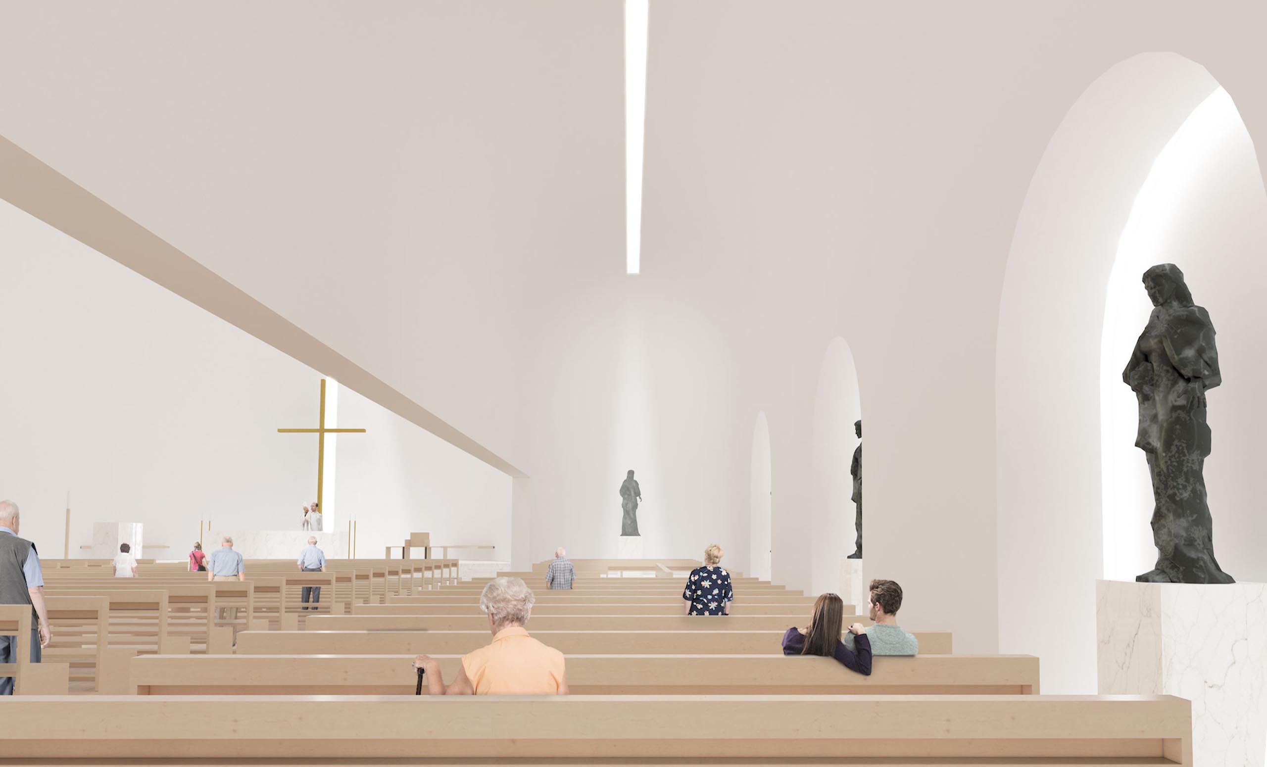
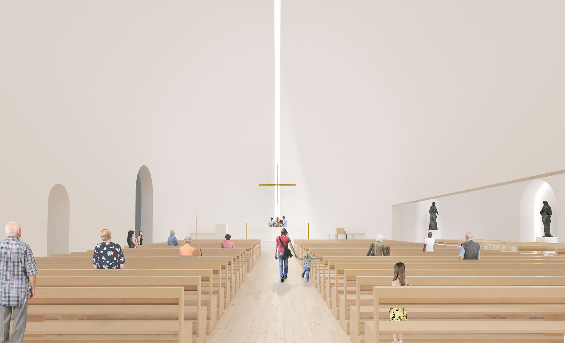
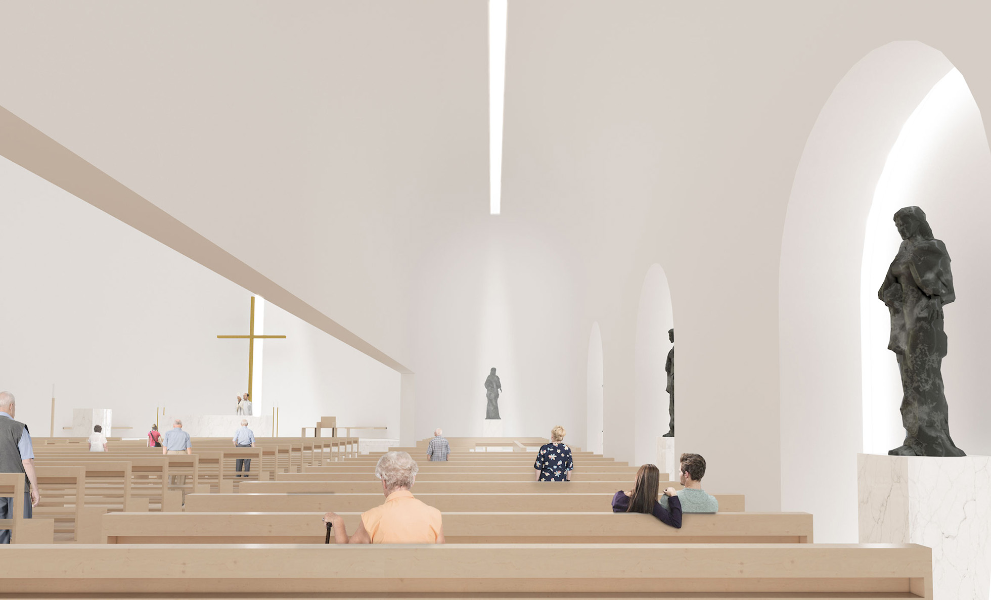
The interior of the church explores the archetype of the church in its most classic aspect, with a central nave and two aisles, although with a touch of contemporaneity. The central nave emerges as a vaulted space, with generous proportions, torn by a continuous entrance of light that guides us to the presbytery, a space that finishes the central nave, creating a kind of contemporary apse.
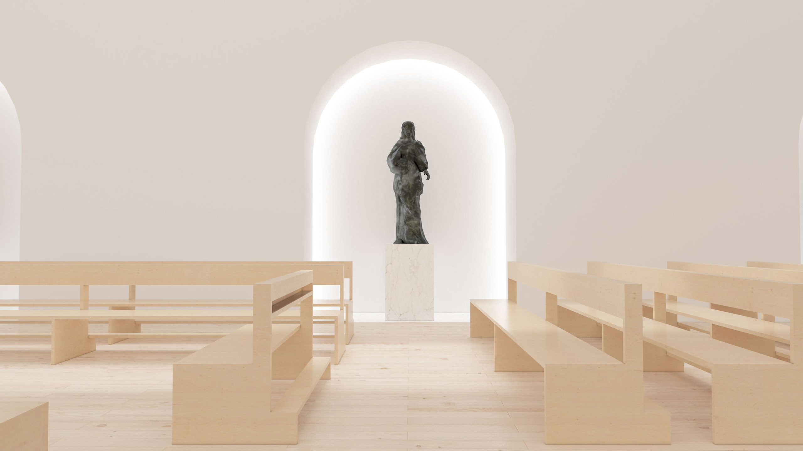
On the side of the central nave is a side nave, on a smaller scale, with an equally vaulted ceiling, which culminates in a small apsidiole consecrated to the image of Santo Tirso, and along this nave has small niches to receive the images of the saints.
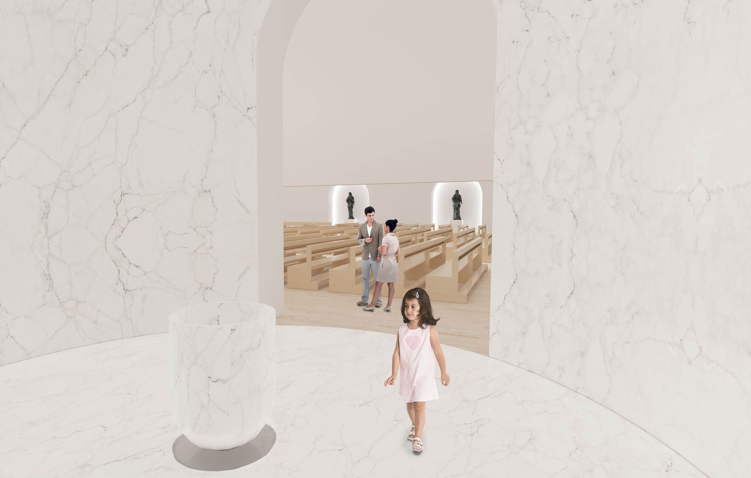
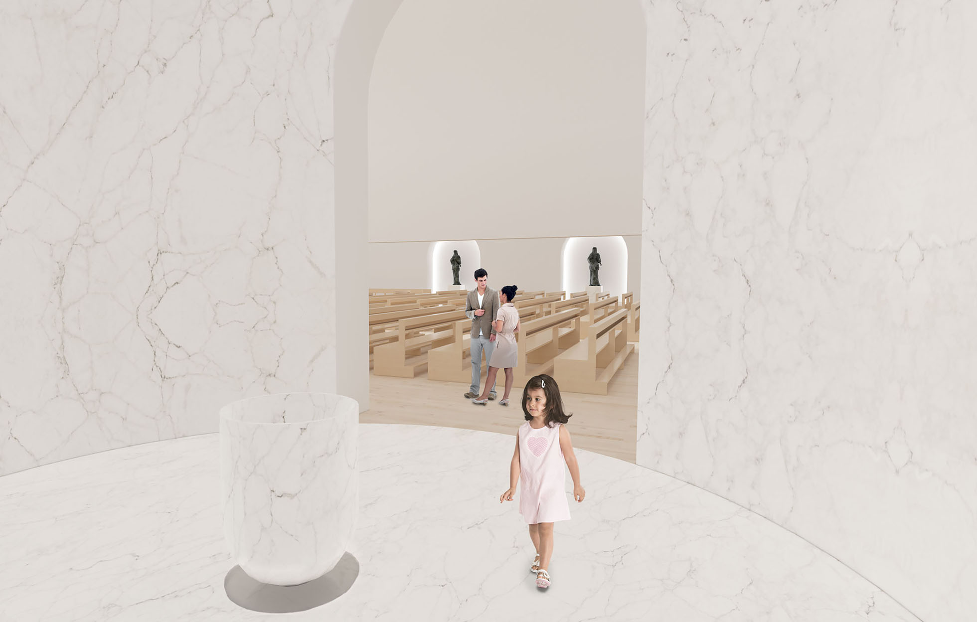
On the other side of the central nave are the most introspective spaces, such as the baptistery, the confessional, and the chapel of the Blessed Sacrament. These spaces relate directly to the church but assume a more modest position that invites introspection and prayer.

- Project Year: 2015
- Area:
- Site: Meinedo | Lousada
- Code: 15ISMM
- Coordinators:
- Henrique Marques | Architect
- Rui Dinis | Architect
- Collaborators:
- Marco Santos | Architect
- Marta Silva | Architect
- Tiago Maciel | Architect
- Financial Director:
- Carla Duarte | CFO
